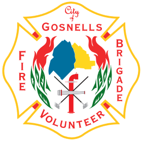
“In 2008 the Brigade set about developing a new logo and conducted an internal competition amongst its members to develop a professional logo that was representative of the Brigade. This competition was won by Michael Battrick and the Brigade formally adopted the new logo in 2008.
The logo contains several key elements, including:
- The overall shape of the logo is the “Maltese Cross” variations of which have long been associated with emergency responders worldwide. Each of the 8 points are said to represent characteristics of emergency responders: Observation, Tact, Resource, Dexterity, Sympathy, Perseverance, Discrimination and Explicitness.
- The green and red represents leaves of the bushland and fires respectively. These come from the FESA adaptation of the original Bush Fires Board logo.
- The blue and yellow areas (City of Gosnells corporate colours) combine to represent the shape of the City of Gosnells district with blue representing the Gazetted Fire District (FRS) and yellow representing the Bush Fire Brigades primary response area
- The crossed rakes hoes, standpipe and hose branch represent the firefighting efforts undertaken by the Brigade.
- The reference to the “City of” recognises the amalgamation of the 3 brigades within the district in 1983 to form the City of Gosnells Bush Fire Brigade”
